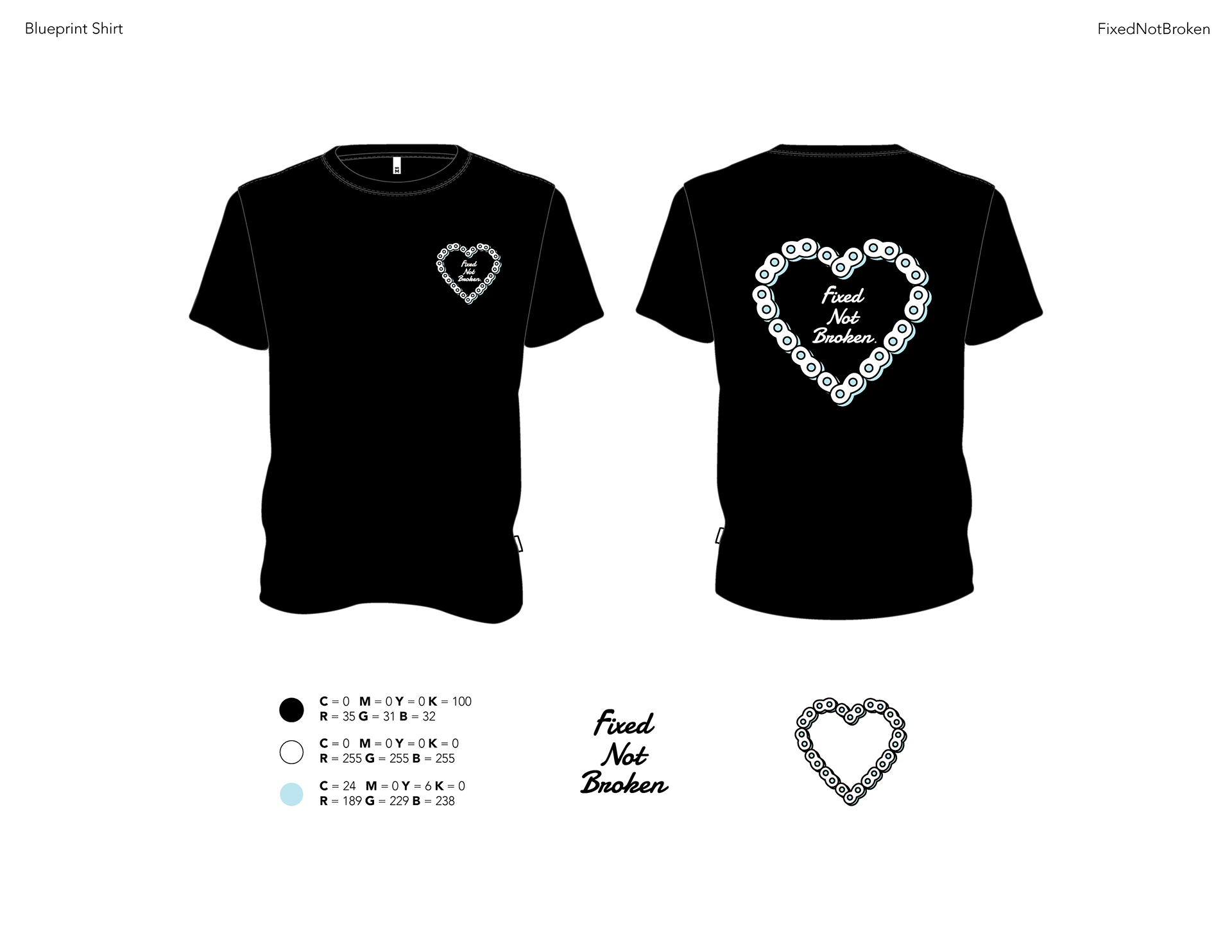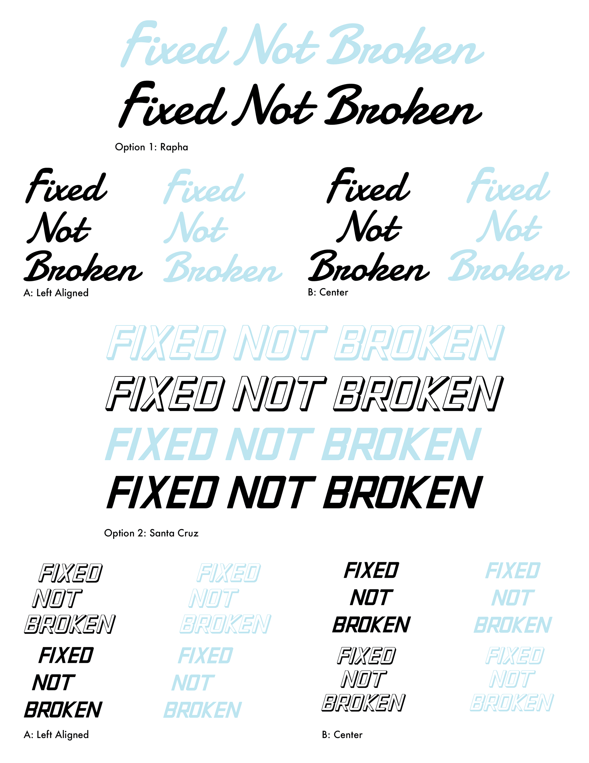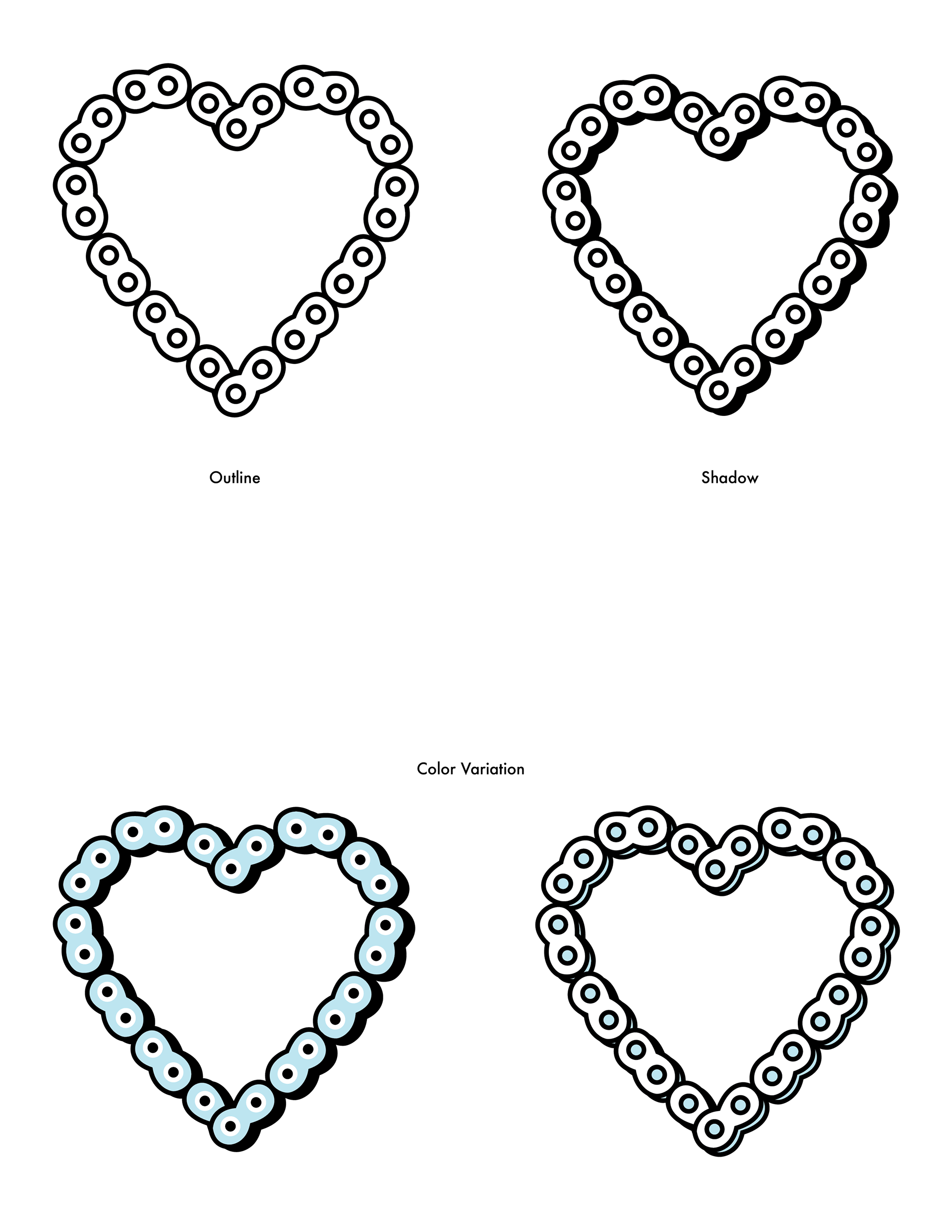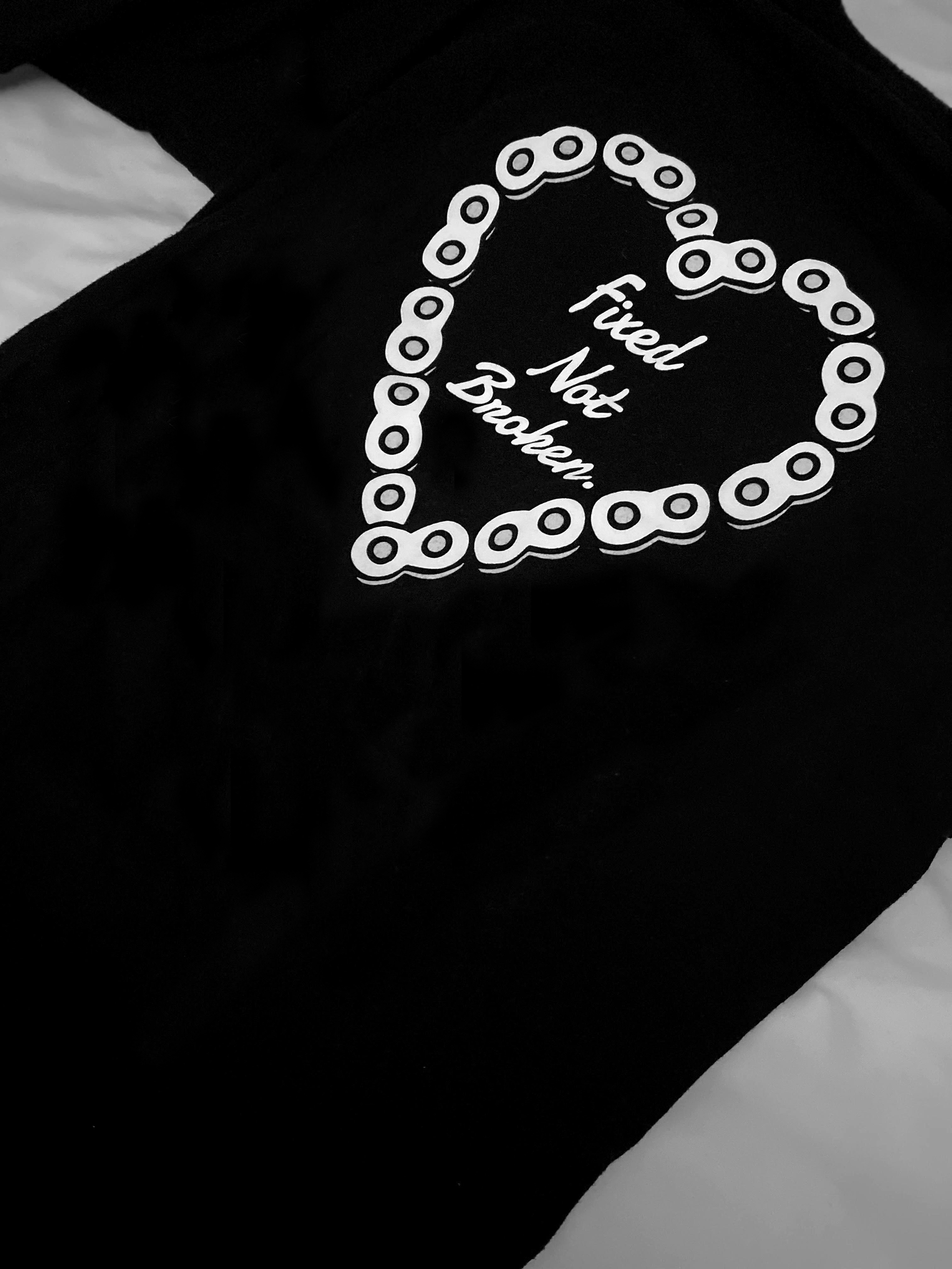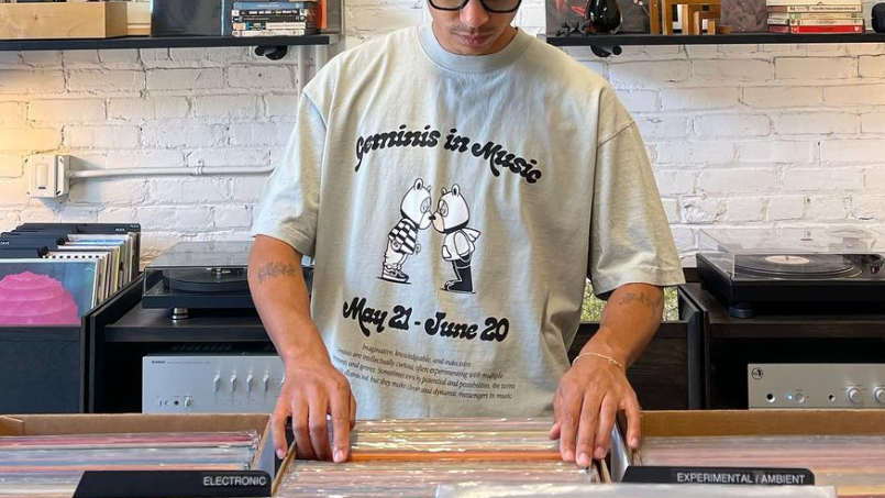

To strengthen member loyalty, encourage advocacy, and enhance the club’s visibility, I designed a series of custom t-shirts for a cycling brand. These designs were carefully crafted to reflect the brand’s identity and resonate with the club’s passionate members.
By incorporating bold graphics, meaningful symbolism, and high-quality illustrations, the shirts became more than just apparel—they served as a badge of belonging. The thoughtfully designed merchandise not only fostered a sense of community among cyclists but also turned members into brand ambassadors, increasing awareness and visibility both on and off the road.
By incorporating bold graphics, meaningful symbolism, and high-quality illustrations, the shirts became more than just apparel—they served as a badge of belonging. The thoughtfully designed merchandise not only fostered a sense of community among cyclists but also turned members into brand ambassadors, increasing awareness and visibility both on and off the road.