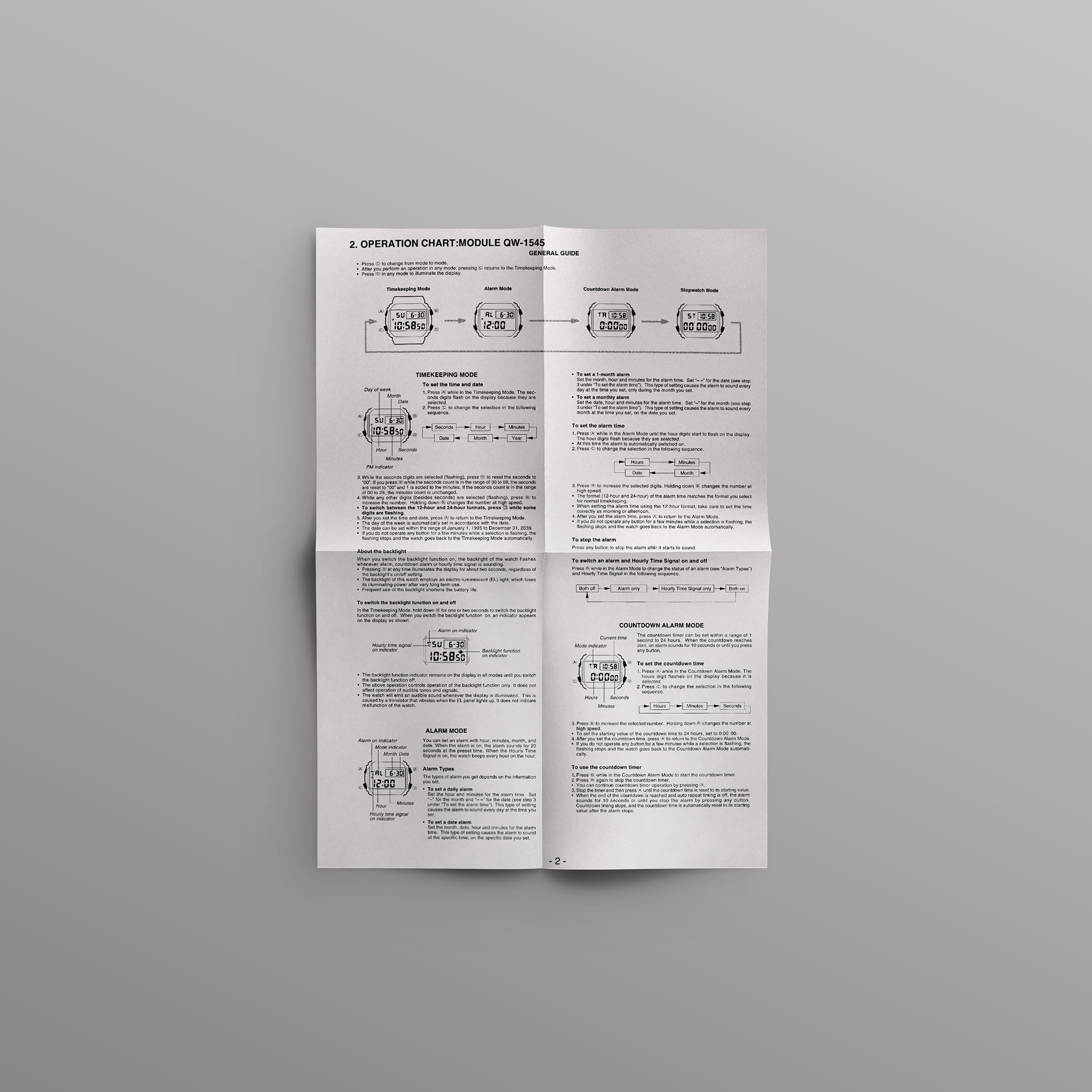
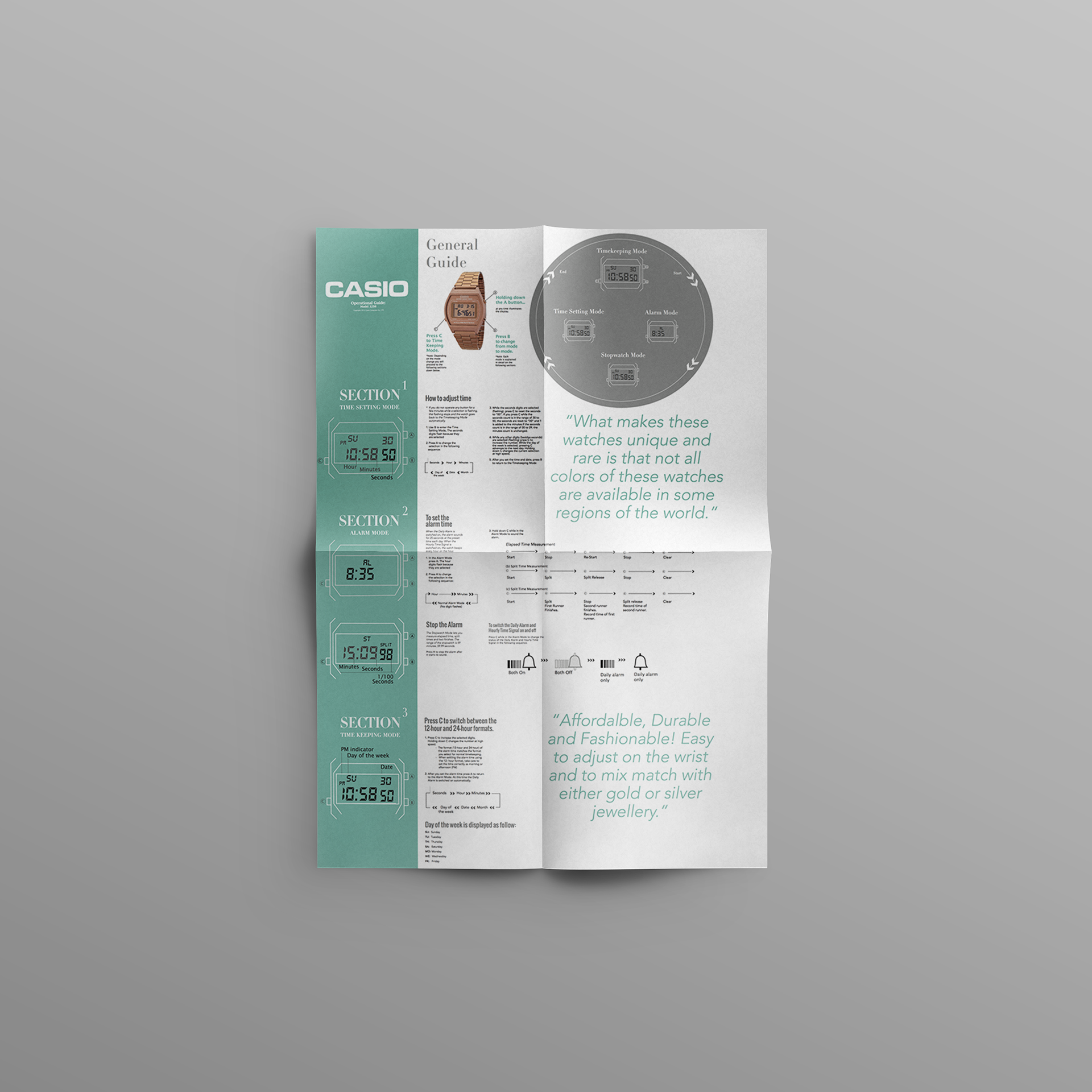
I was tasked with updating an outdated manual for a Casio watch, which was difficult to navigate and left users feeling directionless. The original manual lacked clear guidance on how to approach different parts of the watch, making it challenging for users to understand its functions.
To address the layout issue, I introduced a colour - coded system. By using bold colours, I created a visual guide that naturally directed the reader’s eye from left to right, making it clear which function or part of the watch the instructions referred to. Additionally, I noticed that the original manual's text was overly condensed, making it difficult to read.
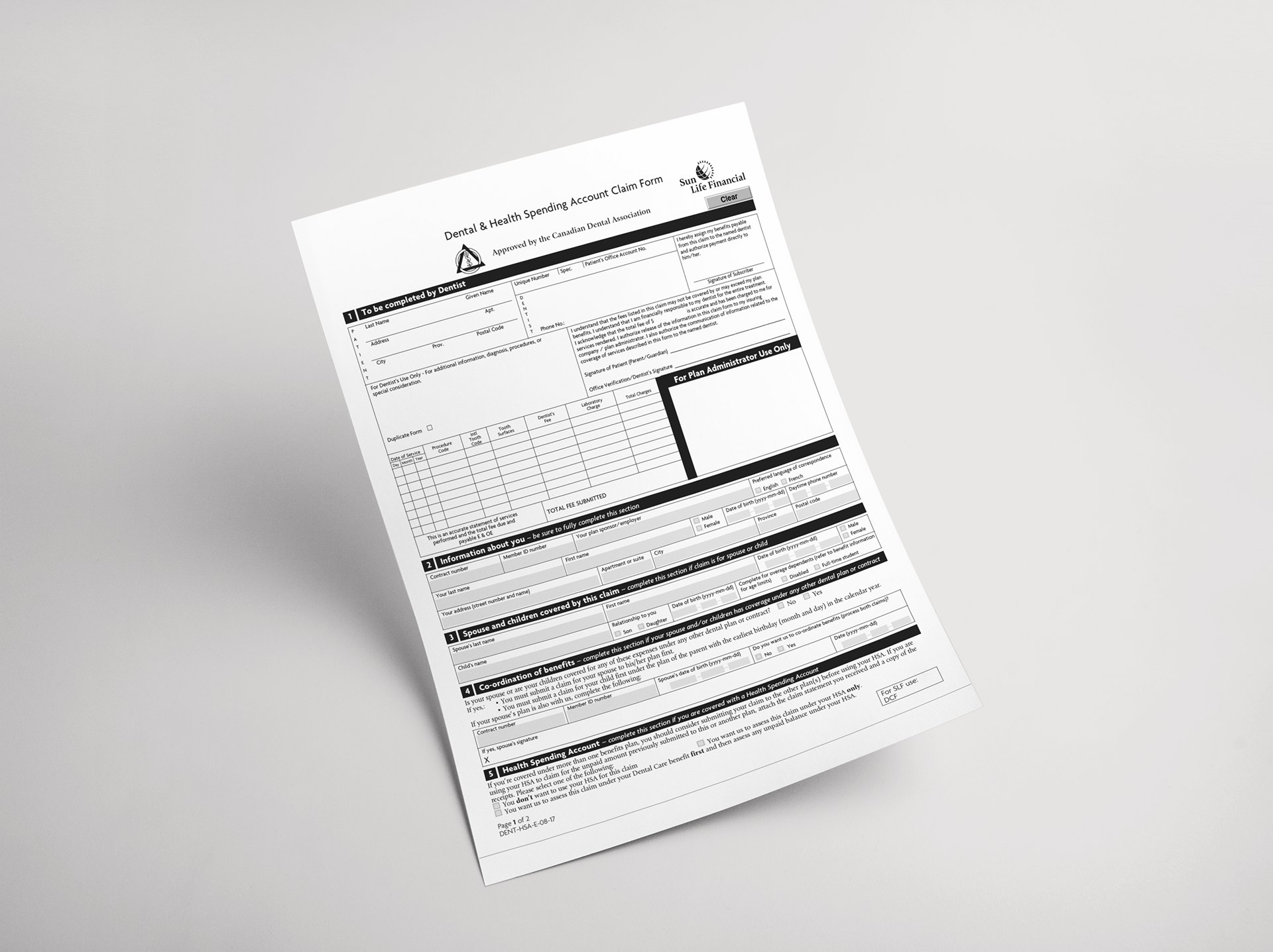
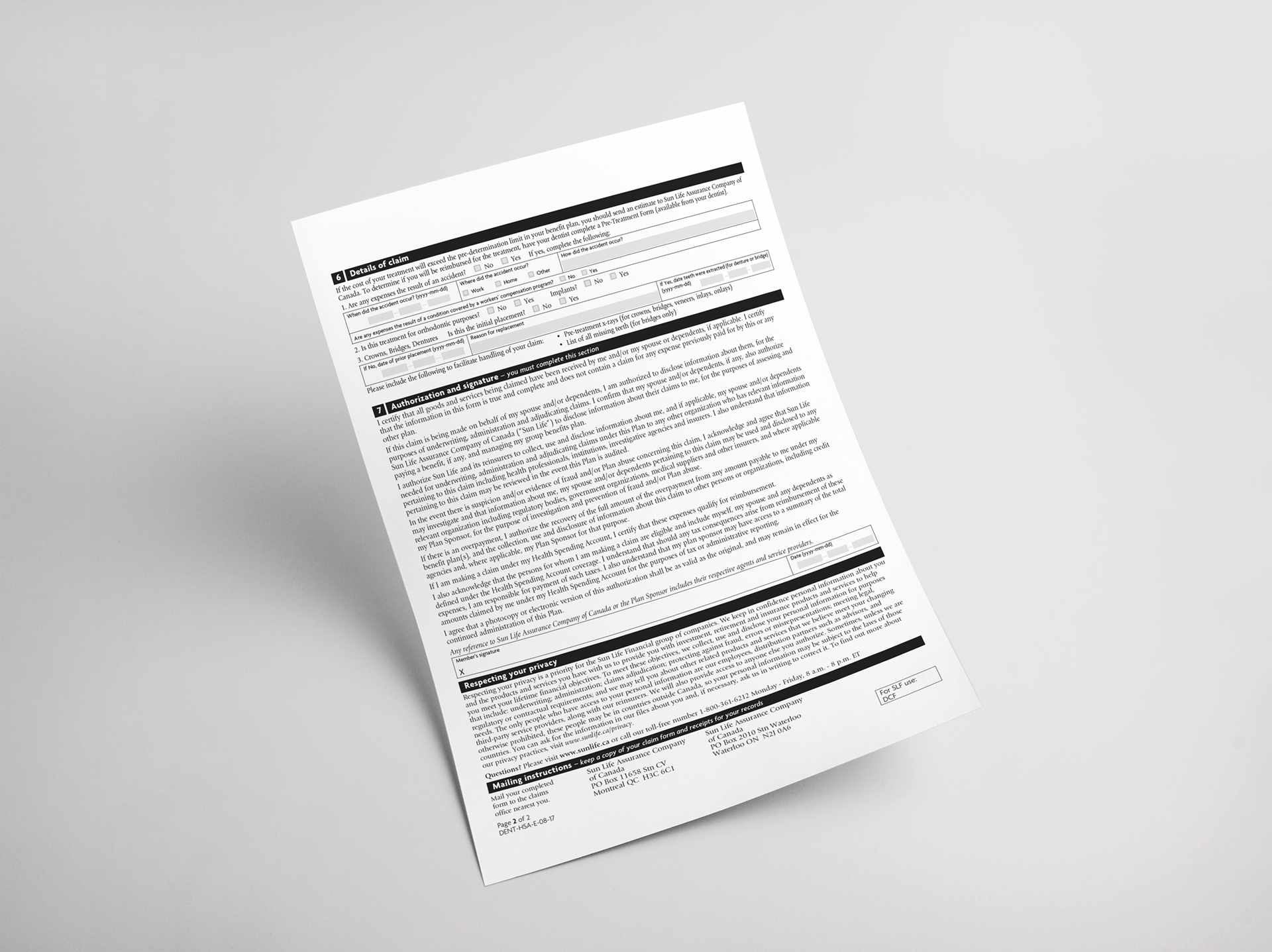
To improve readability, I resized the body copy and carefully condensed the content to keep it focused and engaging without overwhelming the reader. The redesigned manual was significantly easier to navigate, with users able to quickly find the information they needed. The colour-coded layout provided clear visual guidance, while the improved text formatting made the manual more accessible and user-friendly. Overall, the project succeeded in creating a more effective and intuitive user experience.
